|
Matching color, texture, and sheen is often the most challenging part of restoration. This lesson helps clarify the process
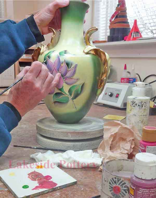
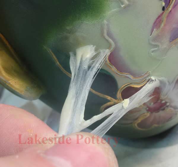
To achieve a seamless and nearly invisible repair, the color and surface sheen must match as closely as possible. One challenge is that colors can shift as they dry and may change again once a cold glaze or protective coating is applied. These variables must be anticipated during the paint-mixing process, as they can darken or lighten the tone or even alter the hue itself.
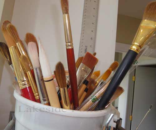
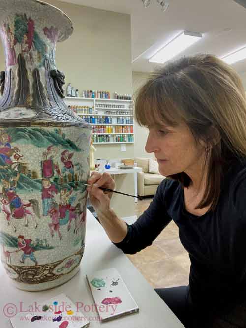
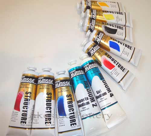
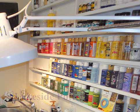
We primarily use acrylic paints, though depending on the project, we may also work with oil paints, mineral pigments, or dyes. For first-time DIY restorers, water-based acrylics are usually the best starting point because of their ease of use, flexibility, and forgiving nature.
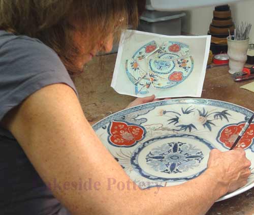
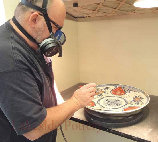
Professional studio note: This lesson is based on the hands-on ceramic, pottery, porcelain, and sculpture restoration work performed at Lakeside Pottery Studio. Successfully matching a repaired surface involves far more than color alone. Professional restoration must also account for surface preparation, optical layering, texture recreation, and the final sheen to achieve a convincing result.
Related lessons:
A detailed explanation of advanced color-matching theory is available in appendix 1 below
|
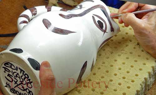
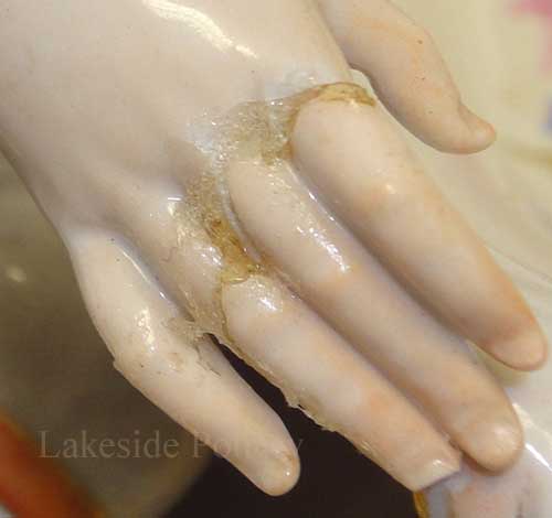
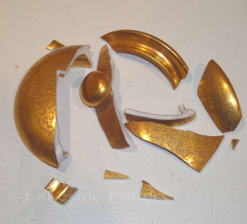
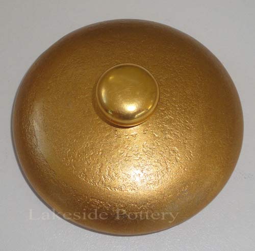
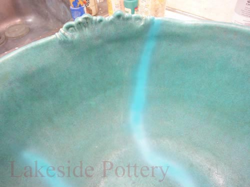
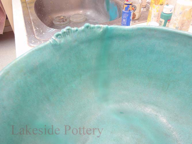
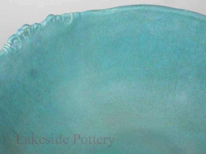
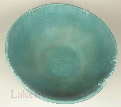
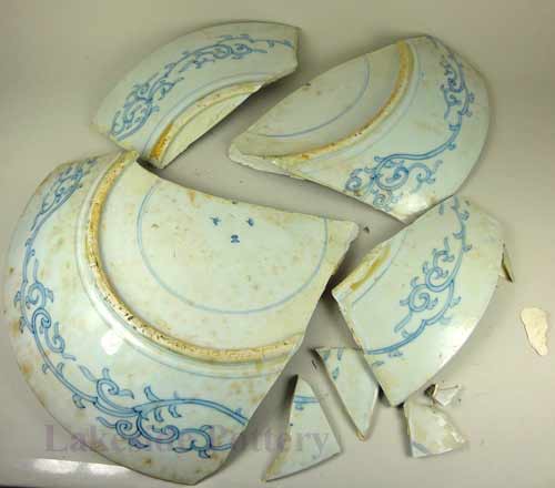
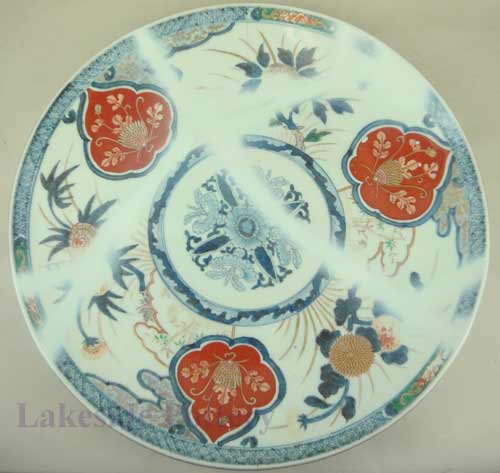
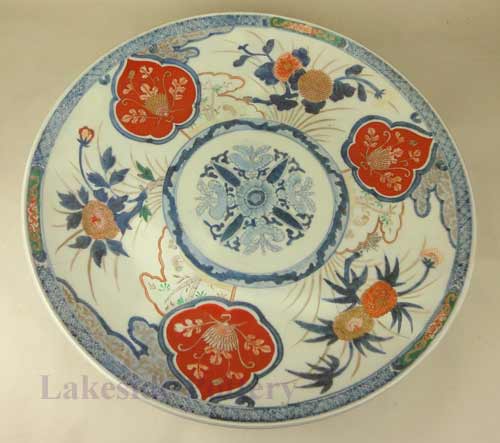
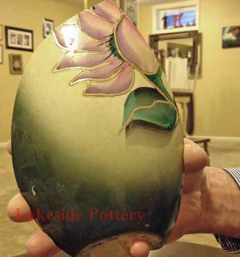
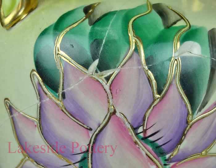
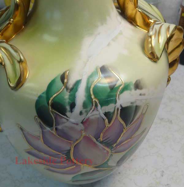
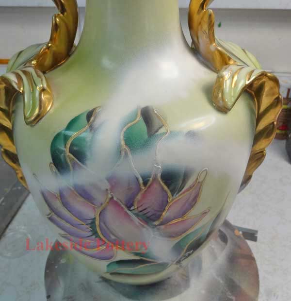
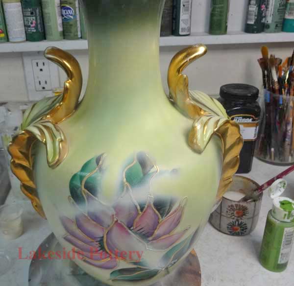
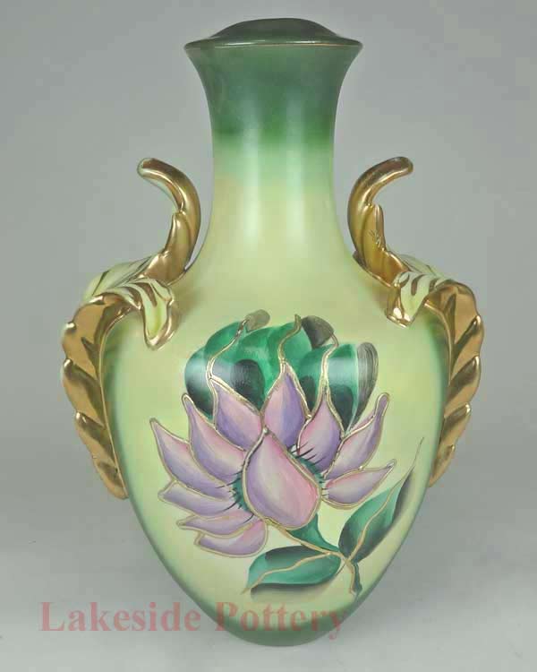
Repair Example from Broken to Seamless
How to Mix Color: Basic Theory
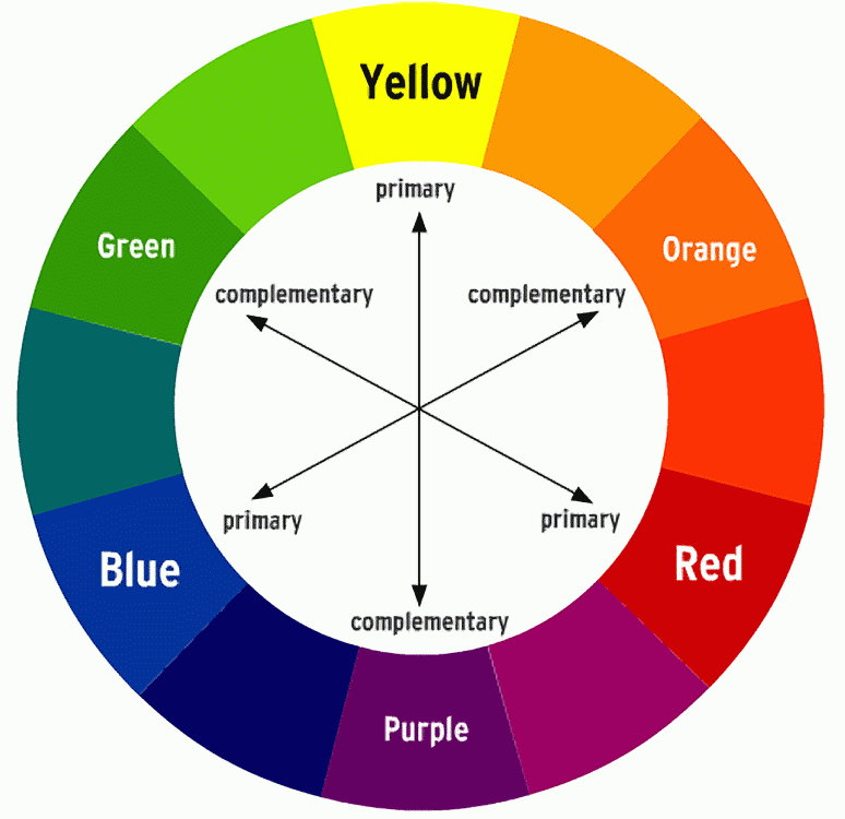
Any color can be created using a core palette of nine colors: the three primaries, blue, red, and yellow; the three secondaries, green, orange, and purple; plus white, black, and ocher.
Understanding these basics is important when starting to paint repaired ceramics or sculptures. If you already have painting experience, you may skip this section. While reading theory is useful, hands-on practice with actual color mixing is essential to developing skill.
A solid grasp of the color wheel helps guide this process:
- Primary colors (blue, red, yellow): These cannot be mixed from other colors
- Secondary colors (orange, violet, green): These are made by combining two primary colors. For example, mixing yellow and red creates orange.
These six colors form the foundation of the color wheel.
However, this is where theory and practice diverge. The color wheel is a helpful tool for understanding relationships between colors, but it isn't a reliable guide when selecting paints for repair work. The real-world variations in pigments and how they behave are far more complex than the wheel suggests.
For example:
- Cadmium Red leans toward orange (a yellow bias)
- Alizarin Crimson leans toward purple (a blue bias)
So, buying a "pure red" or a "pure yellow" is a myth, they don't really exist in practice.
Developing your Artist's Eye
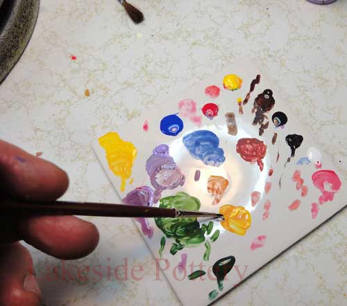
Developing your artist's eye takes time. While a few people have a natural instinct for color, most need practice, so be patient with yourself. In the beginning, you might feel confident that you've mixed the perfect color. But once it's applied next to surrounding colors, or the original you're trying to match, it can suddenly look completely wrong. That's normal. The only way to train your eyes and brain to recognize subtle shifts in hue, value, and saturation is through trial and error. Over time, with repeated attempts, you'll begin to see what's missing, whether it needs a touch more blue, warmth, or brightness. It's a skill built slowly, but it does come.
What is Hue?
Hue is the simplest aspect of color to understand. At its most basic, it's an art term that refers to the actual color of a pigment or object, such as red, blue, or yellow.
What is Value?
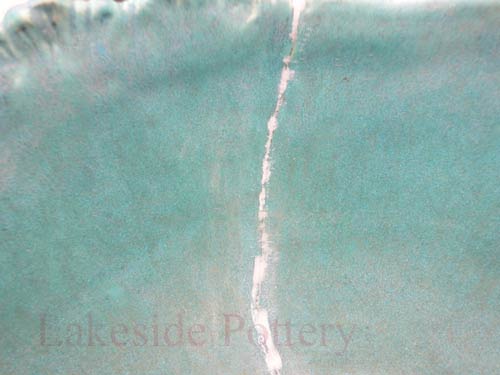
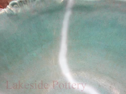
Value, also called tone, refers to how light or dark a color is, regardless of its hue. It's an essential part of color mixing and matching in restoration. One challenge with value is that our perception of it is heavily influenced by surrounding colors. A color that seems light in one context can appear much darker when placed next to even lighter tones, and vice versa. (See image on right.). Understanding and controlling value is key to achieving realistic and seamless repairs.
What is Chroma?
Chroma, also called saturation or intensity, measures how vivid or pure a color appears. Think of it as the difference between a bright, undiluted color and one that has been muted by adding white, black, gray, or by thinning it with glaze. You can adjust a color's chroma by adding neutral gray of the same value (lightness) as the color you're trying to modify. This lets you reduce the intensity without shifting the value or hue too drastically.
Aren't Value and Chroma the Same Thing?
Color mixing would be much easier if they were, but they're not. Chroma refers to how pure or intense a hue is, while value refers only to how light or dark a color appears, regardless of its hue. In other words, value ignores the color itself, focusing only on its brightness or darkness, whereas chroma is all about the richness or dullness of the color.
Do I Need to Consider Hue, Value, and Chroma Every Time I Mix a Color?
As a beginner painter, the answer is yes. It's important to consciously evaluate the hue, value, and chroma of the color you want to match before mixing. Taking the time to make a judgment on each aspect helps reduce wasted paint and frustration. The good news is that with experience, this becomes less of a deliberate, systematic process and more intuitive. Over time, you'll develop a natural sense of these elements and mix colors more quickly and accurately.
How to Match a Color?
When you first start, it's advisable to take your time to understand each step.
Step 1: Analyze the hue, identify which color on the color wheel it's closest to.
Step 2: Analyze the value, determine how light or dark the color is.
Step 3: Analyze the saturation (chroma), assess how bright or dull the color appears.
Some Color Recipe Examples
Blue Green: 1 part yellow, 3 parts blue
Blue Violet: 2 parts blue, 1 part red
Brown: 1 part yellow, 1 part red, 1 part blue
Charcoal: 2 parts blue, 1 part red, 1 part yellow
Citron: 1 part orange, 1 part green
Flesh: Start with white and add yellow, red, brown, and sometimes blue. Note: Flesh is the hardest color to describe (as you might imagine), so experiment with the ratios.
Green: 1 part yellow, 1 part blue
Olive: 1 part green, 1 part violet
Orange: 1 part red, 1 part yellow
Pink: 1 part red, 1 part white
Red Orange: 2 parts red, 1 part yellow
Red Violet: 2 parts red, 1 part blue
Russet: 1 part orange, 1 part violet
Violet: 2 parts blue, 1 part red
Yellow Green: 2 parts yellow, 1 part blue
Yellow Orange: 2 parts yellow, 1 part red
White makes any shade lighter, while the opposite color on the color wheel will darken it.
Important: Artificial light always leads to inaccuracy in color matching, so use natural light whenever possible.
|
Color wheel
Oil paints
Acrylic paints
Mixing colors
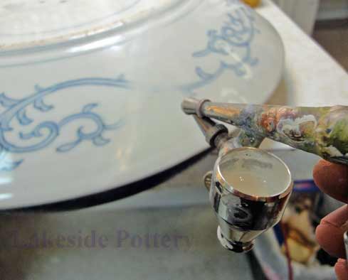
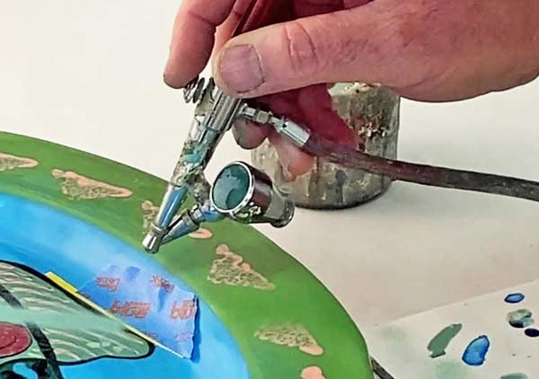
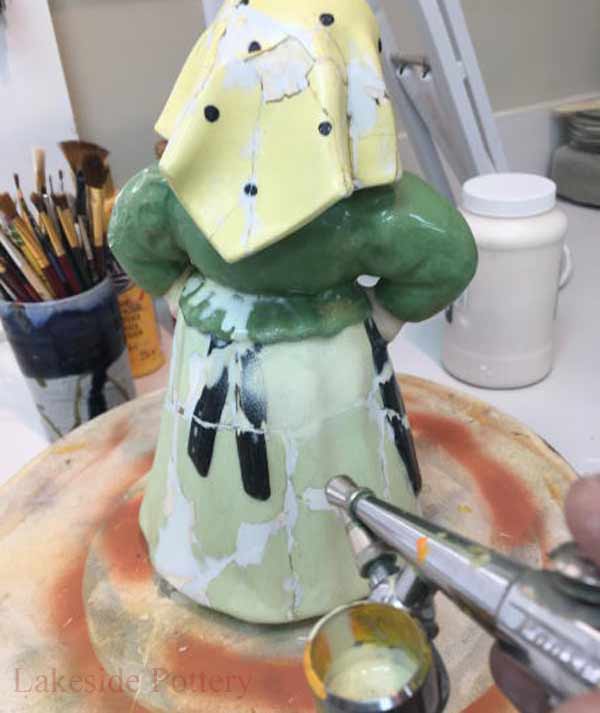
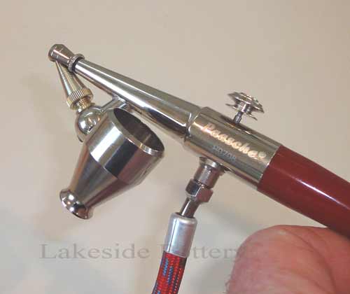
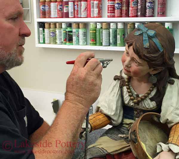
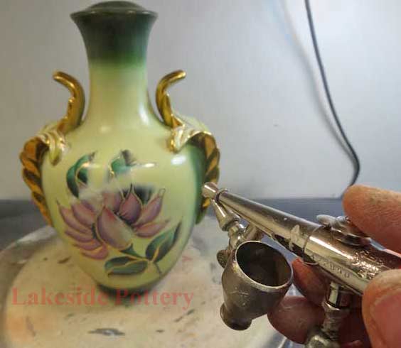
Spraying with airbrush

Values
Example
Target color
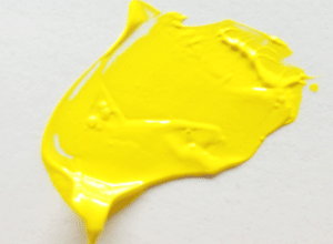
Starting with yellow
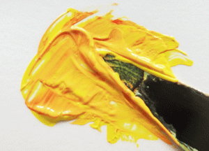
Adding colors
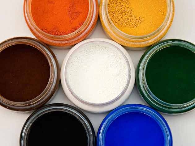
Mineral pigments
Cold glaze, non-yellowing - to Purchase
|